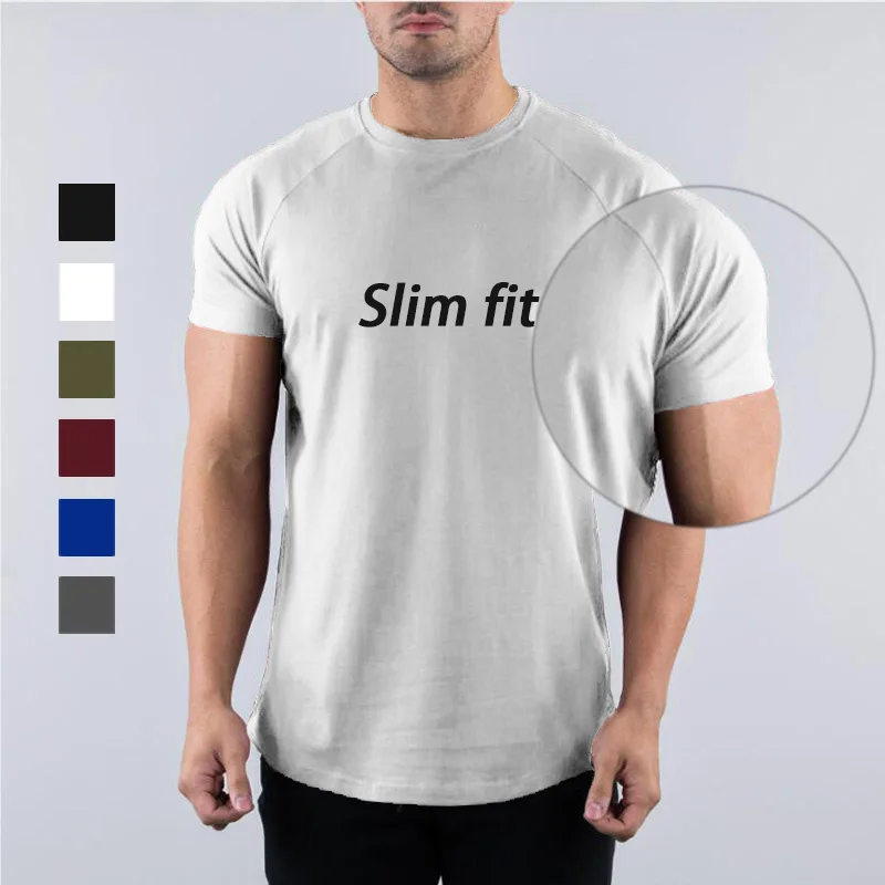
Appliqué embroidery relies on color contrast and fabric texture to pop—and the right fabric base (cotton, polyester, or blends) amplifies this effect. Below is a targeted guide for your casual/stretchy staples:
Custom Link:
https://www.10units.com/products/high-quality-blank-short-sleeve-men-1601351669949-313016.html
_FewSOASb.jpg "Main-01 (2)_FewSOASb.jpg")
Key Logic: Lightweight, smooth fabrics need bold contrast to make appliqué stand out.
- Best Fabric Colors:
- Solid White (100% Brushed Cotton): Creates crisp contrast for dark appliqué (e.g., black, navy, or red embroidery)—the soft cotton texture prevents the design from looking harsh.
- Deep Navy (60% Cotton + 40% Polyester): Pops with light appliqué (white, cream, or neon accents); the polyester blend adds durability to keep the color rich (no fading that dulls contrast).
- Charcoal Gray (95% Cotton + 5% Spandex): Ideal for metallic appliqué (gold/silver thread); the matte gray base lets shiny embroidery catch light without clashing.
- Examples: White cotton tee + black appliqué logo; navy poly-cotton tee + white geometric appliqué.
- Avoid: Pastel or heathered fabrics (e.g., light pink heather)—their muted, mixed tones blur appliqué edges.
CUSTOM Hoodies Link:
https://www.10units.com/products/top-quality-330-g-blank-heavy-1601551309104-765380.html

Key Logic: Thick, soft fabrics need high-contrast or complementary colors to cut through bulk.
- Best Fabric Colors:
- Heathered Black (80% Cotton + 20% Polyester Fleece): Makes bright appliqué (red, yellow, or royal blue) pop; the heathered texture adds depth without overwhelming the design.
- Oatmeal (100% Brushed Cotton Fleece): Perfect for dark or earth-tone appliqué (olive, brown)—the warm neutral base lets intricate stitching (e.g., 3D letters) stand out.
- Burgundy (70% Cotton + 30% Polyester): Pairs with cream or white appliqué; the rich fabric color balances bold embroidery without looking garish.
- Examples: Black fleece hoodie + red team-name appliqué; oatmeal hoodie + olive floral appliqué.
- Avoid: Neon hoodies (e.g., hot pink)—they compete with appliqué for attention.
Sweatshirts Custom Link:
https://www.10units.com/products/2025-factory-direct-bulk-blank-sweaters-1601542581186-776333.html
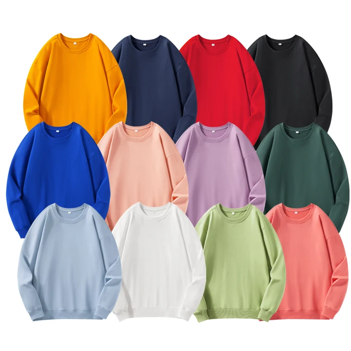
Key Logic: Breathable, textured fabrics (like terry) need clear contrast to highlight appliqué’s edges.
- Best Fabric Colors:
- Solid Forest Green (100% Cotton Terry): Contrasts sharply with white or light blue appliqué; the terry texture adds texture without obscuring stitching.
- Ash Gray (65% Cotton + 35% Polyester): Works for both light and dark appliqué (e.g., black or yellow)—the cool gray base keeps the design versatile.
- Examples: Forest green terry sweatshirt + white athletic-number appliqué; ash gray poly-blend sweatshirt + black logo appliqué.
- Avoid: Striped or patterned sweatshirts—busy bases make appliqué look cluttered.
Activewear Custom Link:
https://www.10units.com/products/high-quality-anti-sweat-cotton-sports-1601596354255-234027.html
Key Logic: Stretchy, moisture-wicking fabrics need high-visibility contrast for functional (and stylish) appliqué.
- Best Fabric Colors:
- Neon Yellow (100% Polyester + 5% Spandex): Makes black or dark blue appliqué (e.g., safety logos) highly visible; the smooth polyester surface keeps appliqué flat (no stretching that distorts design).
- Black (85% Polyester + 15% Spandex): Pairs with reflective silver/gold appliqué—critical for low-light activity (e.g., running gear); the spandex blend ensures appliqué stays intact during movement.
- Examples: Neon yellow activewear top + black reflective appliqué; black spandex-blend leggings (paired with matching top) + gold appliqué.
- Avoid: Light gray or beige activewear—sweat/stains dull contrast quickly.
Polo Shirt Custom Link:
https://www.10units.com/products/personalized-simple-comfortable-blank-printing-logo-1600074650548-948383.html
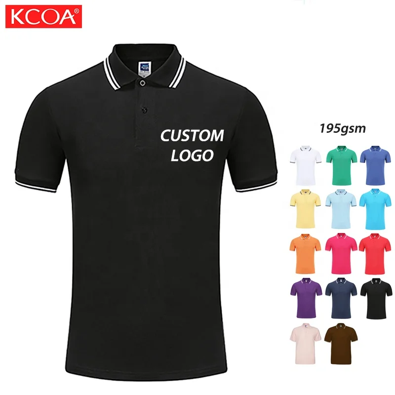
Key Logic: Structured, polished fabrics need subtle (but sharp) contrast for a professional look.
- Best Fabric Colors:
- Navy Piqué (100% Cotton): Makes white or light gray appliqué look crisp; the piqué texture adds subtle depth without competing with the design.
- White Piqué (70% Cotton + 30% Polyester): Ideal for navy or dark green appliqué (e.g., corporate logos); the polyester blend prevents wrinkling that blurs edges.
- Examples: Navy piqué polo + white brand-appliqué; white poly-cotton polo + dark green monogram appliqué.
- Avoid: Light pastels (e.g., baby blue)—they make appliqué look washed out in bright light.
- Contrast First: Pair light fabrics with dark appliqué (or vice versa)—this is the simplest way to make details stand out.
- Fabric Finish: Matte fabrics (cotton) let shiny appliqué (metallic thread) pop; smooth fabrics (polyester) keep sharp-edged appliqué crisp.
- Avoid Clashing: Stick to 2–3 colors total (fabric + appliqué) to keep the design focused.

_jRjfWu6t.png "https://image.jumitop.cn/www.10units.com/2025/12/11/image_folder/贴布绣 (7)_jRjfWu6t.png")
_6sq7QitC.png "贴布绣 (6)_6sq7QitC.png")
_w8l4LMzH.png "How to choose the right fabric?")
_yKzmH9QU.png "What kind of clothes are more suitable for sports and fitness?")
_Bvbgroh9.png "How to choose the weight of clothes in different seasons?")
_7TdoOitE.png "What are the benefits of custom team T-shirts?")
_o28S2W2I.png "How to select the fit of clothes for different body types?")