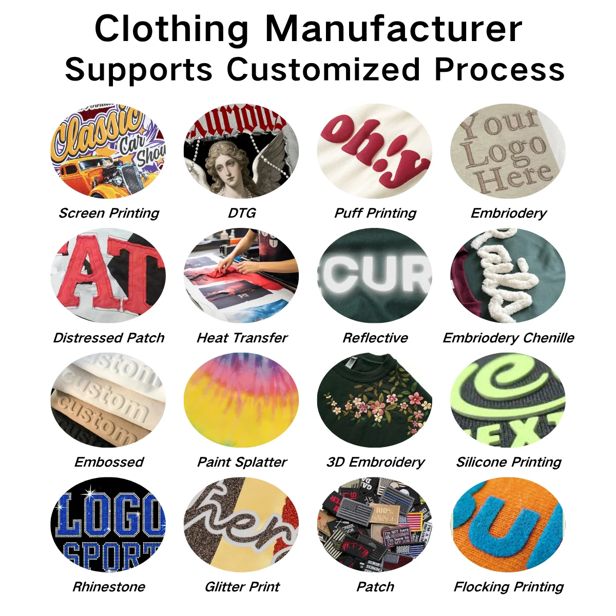
Layering appliqué embroidery with other print techniques is a game-changer for premium streetwear, blending tactile texture, bold visuals, and brand identity into one standout design. Appliqué’s raised, fabric-based details pair seamlessly with various printing methods to create depth, contrast, and a high-end look that elevates custom t-shirts and hoodies above mass-produced styles. The key is balancing textures, colors, and placements to avoid cluttering the design—while highlighting the unique strengths of both appliqué and complementary prints. Below are the essential tips to master this layering technique for premium streetwear:
Click to see more details:
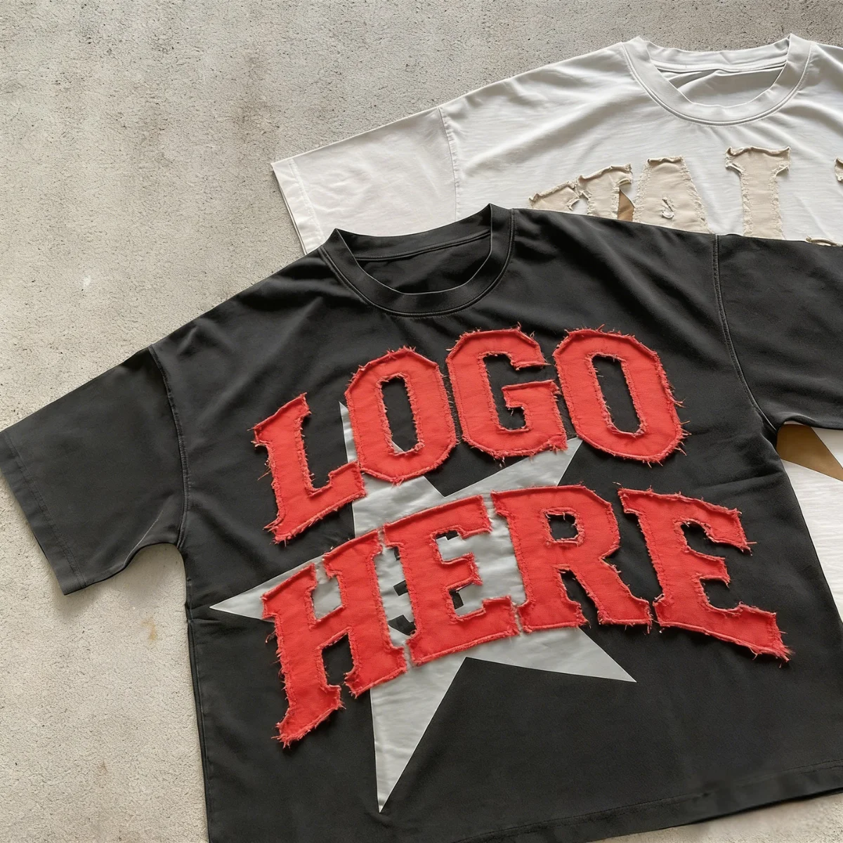
1.Pair Appliqué with Puff Print for Bold 3D Depth
Mixing appliqué—those raised fabric layers—with puff print (the foam-based 3D ink) gives streetwear that premium, multi-dimensional look everyone loves. Stick to appliqué for the bigger, more structured parts—think brand logo outlines, geometric shapes, or graphic borders. Then layer puff print details on top or around the appliqué to boost texture and depth.For instance, you could add a puff print brand name inside an appliqué shape, or use small puff print accents—dots, lines, tiny logos—to frame the appliqué. Keep your color palette consistent, too. Neutral appliqué with bold puff print works great, or match tones for a softer, luxe finish. Either way, it keeps the design clean. This combo is perfect for oversized hoodies, statement tees, and streetwear jackets—adds that tactile edge that makes pieces stand out.
-------------------------------------------------------------------------------------------------------
2.Use Screen Printing as a Base for Appliqué Focus
Screen printing is your go-to for creating a subtle base layer—full-background or partial—that lets appliqué be the star. Start with a simple screen-printed design on a tee or hoodie: maybe a faded graphic, abstract pattern, or a subtle brand watermark. Then layer appliqué on top as the focal point.A good example? A screen-printed gradient or soft stripe pattern as a backdrop for a bold appliqué logo or graphic. This trick adds depth without overwhelming the design—screen print brings visual interest, while appliqué adds texture and that premium feel. Go for low-ink screen prints, too—they keep the fabric from getting stiff, so the appliqué’s texture stays front and center.
-------------------------------------------------------------------------------------------------------
3.Layer Appliqué with Embossed Printing for Subtle Luxury
If you’re going for a more understated, high-end vibe, pair appliqué with embossed printing—that raised, ink-free texture. Use embossed printing for the small, delicate details: tiny brand monograms, soft lines, or geometric accents. Then place appliqué nearby to create a balanced, tactile design.Try adding an embossed border around an appliqué logo, or embossed text below an appliqué graphic. Both techniques lean into texture, not bold color—perfect for minimalist premium streetwear. And make sure your fabric textures complement each other, like cotton appliqué on a cotton tee with embossed details. It keeps the design cohesive and high-quality.
-------------------------------------------------------------------------------------------------------
4.Combine with Sublimation for Vibrant, All-Over Cohesion
Sublimation printing—those full-color, fabric-infused inks—pairs really well with appliqué for vibrant, cohesive streetwear. Use sublimation for all-over prints: bold patterns, abstract art, or color gradients. Then layer appliqué on top to add texture and structure.For example, a sublimated tie-dye or camouflage base gets a nice upgrade with a solid-color appliqué logo or graphic. The key is picking appliqué colors that complement the sublimation print. Neutral appliqué (black, white, gray) works with bold sublimation, or grab a color from the sublimation design to match the appliqué for a seamless look. This pairing is great for lightweight tees and hoodies—blends vibrant visuals with that premium texture.
-------------------------------------------------------------------------------------------------------
5.Add Hot Stamping Accents to Appliqué Edges for Luxury Detail
Hot stamping—gold, silver, or metallic foil—adds that little touch of luxury that pairs perfectly with appliqué’s premium texture. Use hot stamping to outline appliqué edges, add small accents (like a foil dot on appliqué corners), or layer foil text over appliqué details.Take a black cotton appliqué logo, for example—outline it with gold hot stamping, and you get a bold, high-end contrast that catches the light. This technique is ideal for premium streetwear brands that want a subtle, glamorous touch without overcomplicating things. Stick to one metallic color—gold, silver, or rose gold—to keep the look polished and cohesive.
-------------------------------------------------------------------------------------------------------
6.Match Fabric Weights for Durability & Comfort
To keep that premium quality and comfort, make sure the fabrics for appliqué, the base garment, and any printed layers have compatible weights. For example, use lightweight cotton appliqué on a lightweight tee, or heavyweight felt appliqué on a heavyweight hoodie. Avoid mixing thick appliqué with thin, delicate prints—it makes the garment stiff and uneven.Also, pick print techniques that hold up as well as appliqué. Screen printing and sublimation are both long-lasting, so they’re perfect for daily-wear streetwear. Paying attention to fabric compatibility ensures your layered design stays looking premium, even after repeated wears and washes.

Guangzhou Kroad Clothing Co., Ltd.
If you would like to know more, please click the shopping link below.!!!👇👇👇
🌐Shop Now → https://www.10units.com/
📞Whatsapp:+8613763019544
☎️Phone:+86 13763019544
📩Email: abby@10units.com
——Be with Kroad, begin small, become big——
INQUIRY